Today’s DAMP is another birthday card, for a friend that likes futurama. He hasn’t seen it yet, i hope he likes it! Don’t you guys spoil his fun.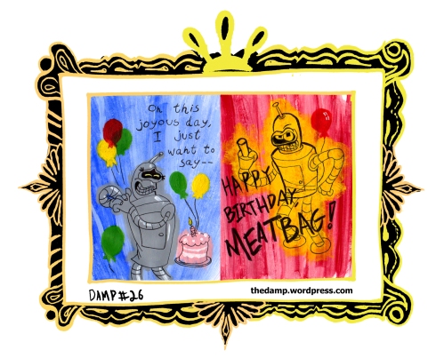 I also like futurama – i liked it a whole lot though before reading the johnk blog! There’s a lot of shows that now bore me, since i can see how uninspired the animation, the background, and so forth are. I still like futurama though, because it has a lot of cool science fiction stuff and there’s a lot of stuff that make me laugh – i’m not gonna lie about enjoying it. But i wish the drawings were cooler! I think my own drawing, flawed though it is, shows that there’s room for crazier looser drawings. Go on futurama! Reinvent yourself! step out of the matt groening, perfectly round eyes mold!!! Not to talk about the comics. SHEESH. Why IS IT that there’s a house style? why dont they hire artist to do their OWN rendition??? How cool would a mike mignola futrama be! or think about ross campbell of wet-moon fame. Go on – imagine a plumpy leela. And those guys arent even CARTOONISTS! Anyway, i took a few pictures of the process that i went through. I’m putting it up so that it could help someone, AND MORE IMPORTANTLY – maybe some accomplished artist would give ME a bit of advice! So far on this blog though i’m pretty much talking to myself, so my advice to myself – stay cool, fonz. stay cool.
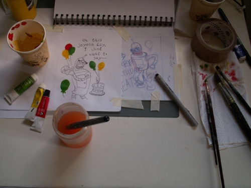
Here’s a photo of most of my tools – pencils, pens, brush pens, brushes, cheap acrylic : i like the ones that come with 12 colors or so, and then buy the cheapest one. Recently i bought a big black and a big white, and the white was over very quickly. I used a lot of white in learning how dominating black can be – the tiniest drop – sometimes i use a toothpick for a very small amount of black – can turn white into dark gray.
I use paper cups as color palletes for each color – they are small, so when i mix the color i dont lose it too much, and they are tall, so i can use my fan without fear of drying the color too quickly. I know this seems wasteful, but i actually use the same cups for many paintings, since they dry up and you can just put more colors in. You can also just clear them out, but i want to build a cool impasto pallete. I use paper-towels to dry brushes – this does seem wasteful; anyone got a tip? would a rag work just as well?
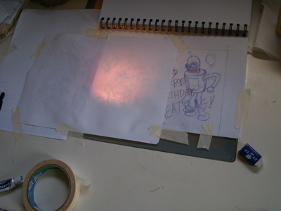
OK, so here’s the nittier gritty. You can see the blue – red pencils drawing i have in my sketchbook. I fastend it down with paper duct-tape, which hurts the pages less when you remove it. What you can’t see is what i cover with the paper which will end up being the card – it’s covering the front of the card, so that when i fold it, it’s the cover. You also can’t see that i already done the inside of the card – the red part. I use a lamp which i place underneath the glass part of my cool ikea table – a wonderful awesome gift.
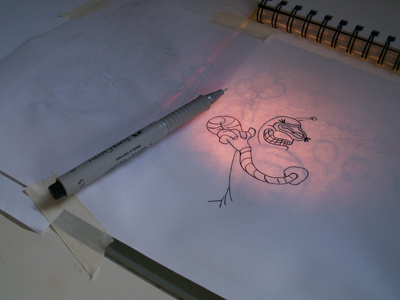
Here i started inking the lines with the 0.3 pigment pen. The pigment pen is excellent, because it can withstand even very wet brush-stroke without being muddied – if i knew this when i was making the mouse-king damp! it would saved me a lot of time. The lines will get thicker soon, but right now i just need the basic positions – the colors arent gonna be perfectly confined anyhow.
Here i finished inking, and painted the baloons with the acrylics straight from the tube. I first did the red, then yellows, then greenes. At the top bunch of baloons i wanted to get a see-through effect. I let the thing dry, but the wonderful thing about acrylics is that it dries FAST. when my work isnt taped down to the table, i often hold it in front of my fan and watch tv.
The reason for painting the baloons first is that i want them to remain without outlines, IN THE COMPOSITION that i drew on the pencil page.
Ok, a bit of a big step, but dont worry! what ive done here is :
Painted the backgroun, which was meant to resemble the futurama intro, By now i was kinda tired so i didn’t match the colors exactly, just went for a feel. After drying it by the fan (the baloons are compositioned well – no need for tape) i went over the cake with pink and white, then did bender in gray. Whilst drying, i penned the words over, since the background was dry. I then did the shines on bender, and after THOSE dried i penned bender. I didn’t use the pigma brush ere, since i wanted this to be the subtler page, with blues, and make the red page cruder.
Also, i kinda forgot. oops! You can see some lineweight near his mouth at this point, but nothing more.
Hey, havei just penned the term PENNED instead of inked? i like it.
If you’ve read all of this manifesto of a process page, you know that most of the troubles here come from trying to get the right lines through layers of acrylic. Below is a comparison of the same baloon, with and without the lamp in my lightbox table.
Notice that the unlit pic – on the right – has a streak of gray which is part of the background. When i switch the table on – the left – I can see the darker shape of the baloon, and the streak nearly disappears; thus, i can REPAINT the baloon’s shape OVER the background.
It’s a lot of work, but i think it’s worth it. I get to practice in traditional means, which is great. it has a nice texture which i like – traditional work’s inherent flaws make a more organic picture, or is at least an easier way of achieveing an organic look (which is not always the mood you want to set).
But the main reason is that IT’S A BIRTHDAY CARD. It’s awesome getting a card where you can see and feel the paint on the paper, the indentations of the penlines, and so forth.
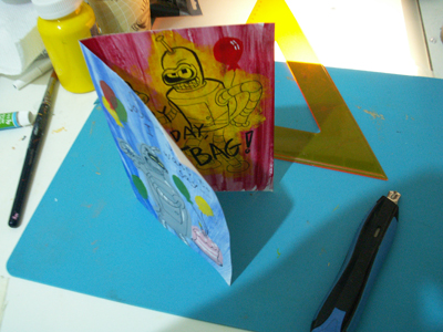
aaand here’s the finished piece, in it’s folded unDAMPed version.
Again, a big step in bad documenting.
After drawing the background over the baloons, then painting the charcter and cake, then penning them, i REpainted the baloons. A lot of work, but now i have baloons without outlines, and in my original composition. It might not be GOOD (i think it is), but i followed the inital plan and the intention of it. One day i’ll be good enough to play-ot-by-ear (“draw it by hand”?).
I then used an old vegetable-cutting board, which is flexible and found a new use as a mat for cutting; I cut the paper into a rectengal using the exacto-knife and a ruler, and folded it. Voila!
SO, that’s the process. Double it – i did TWO pages! Acrylic is actually a great material and very flexible. The best part – you can always “reset” an area by painting another color on it, opaquely.
If i helped anyone – yay for you! if someone has advice – Yay for me!
The Score : Goes to minus three! woo! Time to update the graphics. And now, to sleep. Not me, sillies – YOU! Sleeeeep.


